BabyBliss
BabyBliss
Gentle Organic Design for Baby Care
BabyBliss
Every baby deserves the softest touch—the kind that feels like a mother’s embrace. BabyBliss was born from the desire to create skincare as pure as a newborn’s first breath.
In a world filled with chemical-heavy products, we envisioned a brand that speaks the language of nature—a blend of organic ingredients, mindful packaging, and gentle nourishment for delicate baby skin. From the first drop of lotion to the last loving touch, BabyBliss is designed to be a part of those tender moments between parents and their little ones.
The Design Philosophy: Softness in Every Detail
BabyBliss
Objective
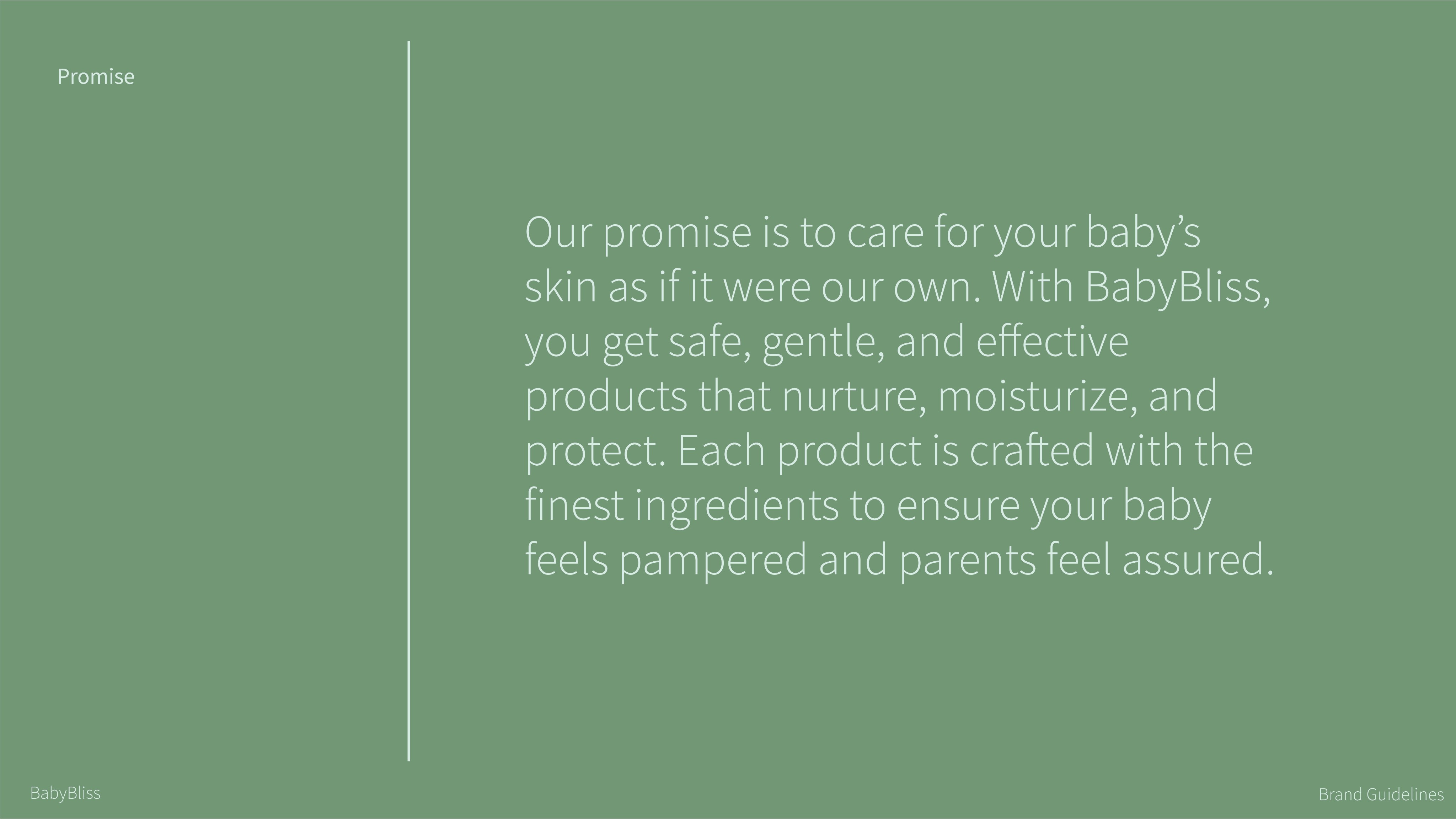
Gentle Care, Pure Bliss – Because Your Baby Deserves the Best
The goal was to create a minimal yet emotionally appealing brand that resonates with parents who prioritize natural and chemical-free skincare products for their babies. The design needed to evoke warmth, softness, and reliability while maintaining a modern, clean aesthetic.
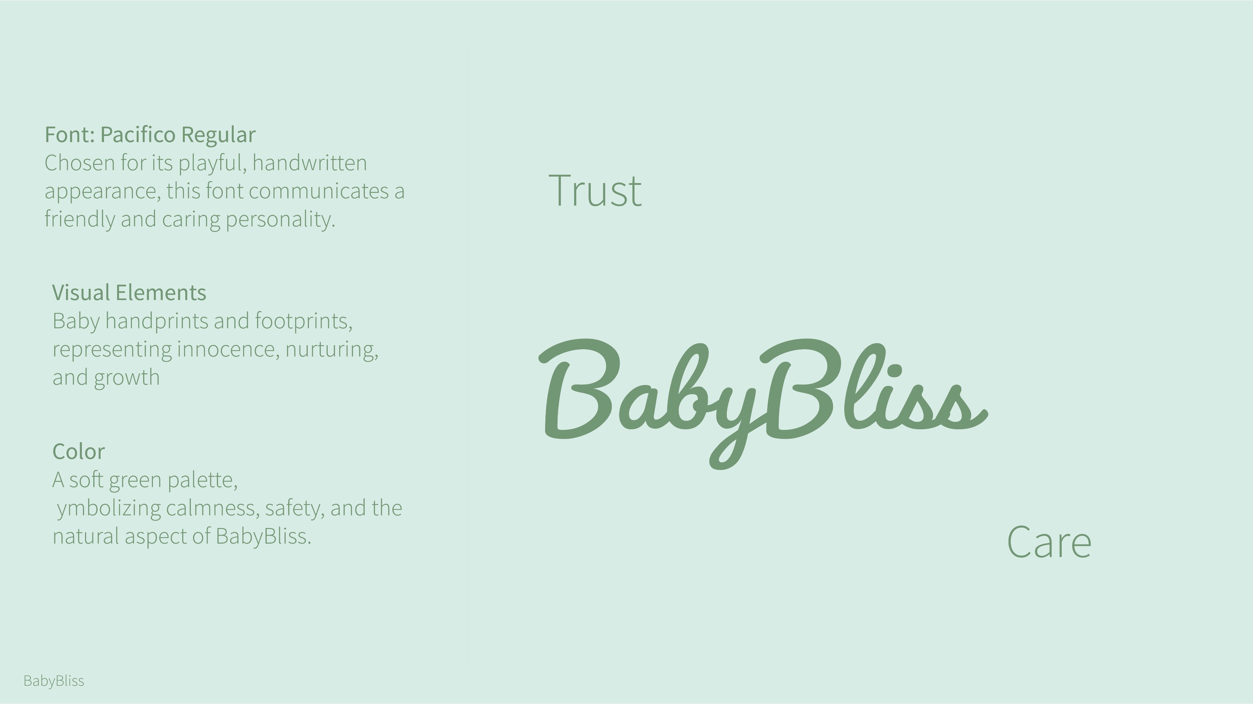
The typography for BabyBliss is carefully chosen to reflect the brand’s warmth, care, and trustworthiness. Pacifico Regular, with its smooth, flowing curves, brings a friendly and playful touch, perfect for the brand logo. Montserrat, a clean and modern sans-serif font, ensures readability across product labels, packaging, and digital platforms.
Final Outcome
• A visually appealing and functional brand
identity that reflects BabyBliss’s core values.
• Packaging that is not only aesthetically
pleasing but also practical, sustainable, and
market-ready.
• A structured design system that ensures
brand consistency across all touchpoints.
Approach & Design Process
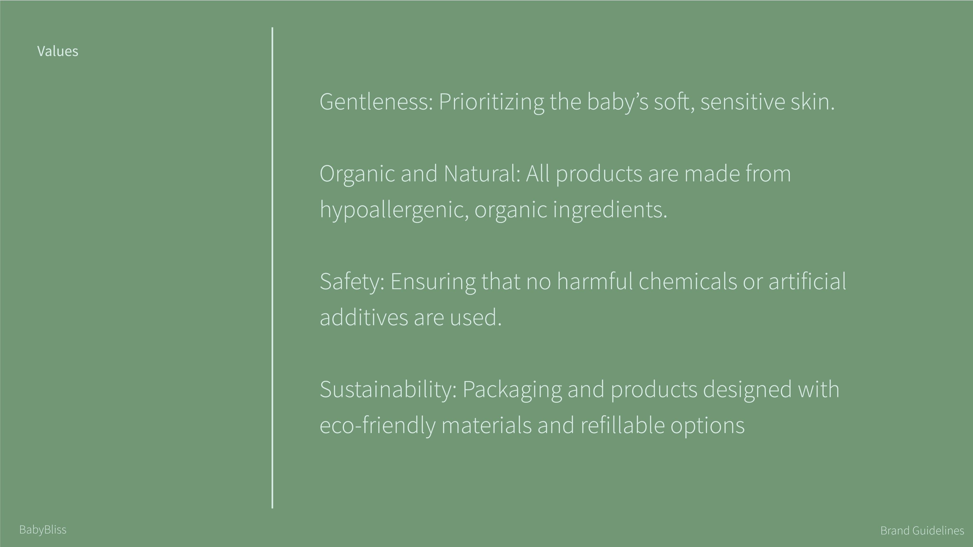
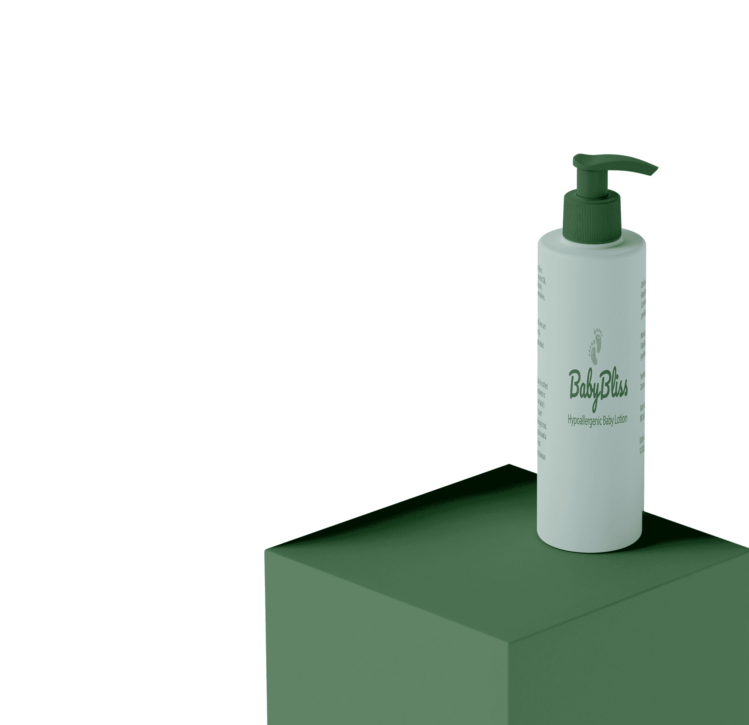
Adaptive Formulas, Probiotic-Infused, 100% Organic Ingredients, and Eco-Friendly Practices
Colour Palette
Striking a balance between nature’s calmness and gentle care, BabyBliss embodies purity, safety, and warmth—reflecting a brand that nurtures with love and trust.
Deeper green (#729676)
Mint green (#729676)
Typography
Brand Guidelines
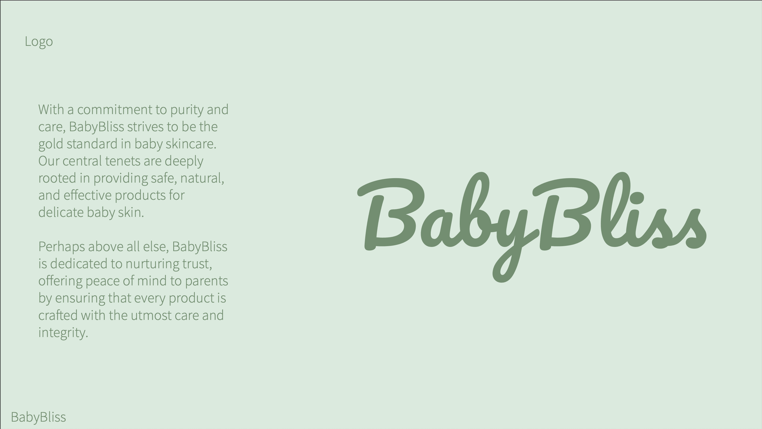
We didn’t just create a product.
We crafted an experience—one that prioritizes safety, trust, and the soothing essence of organic care.
1. Research & Brand Positioning
• Conducted market research on . baby skincare brands to identify gaps and opportunities.
• Studied consumer behavior and preferences in the organic skincare industry.
• Defined the brand’s personality: gentle, trustworthy, and eco-friendly.
2. Brand Identity Development
• Designed a soft, calming color palette featuring light mint green (#D9ECE4) and deeper
green(#729676) to reflect the brand’s organic and soothing nature.
• Created a modern yet playful logo that conveys warmth and care.
• Selected typography that feels elegant and approachable.
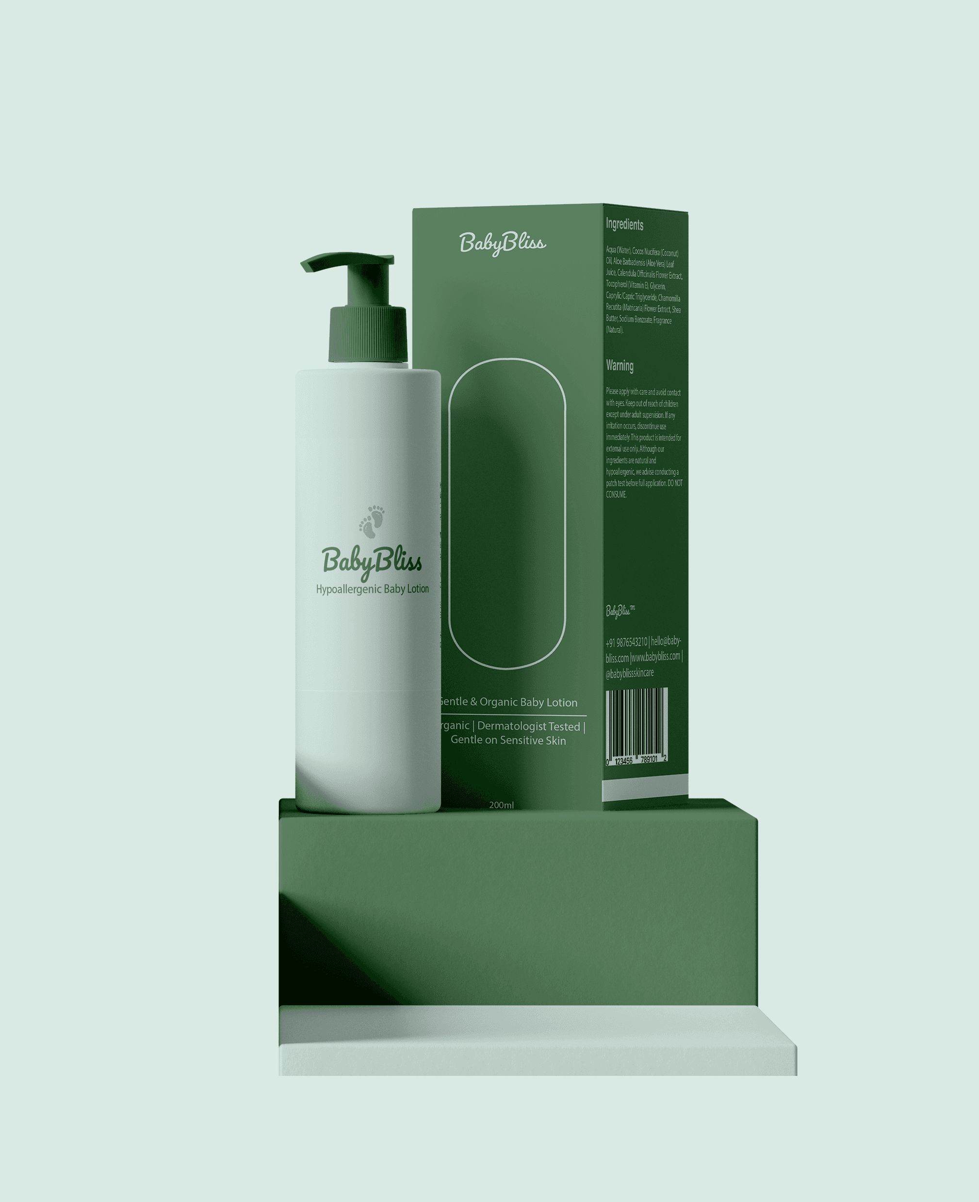
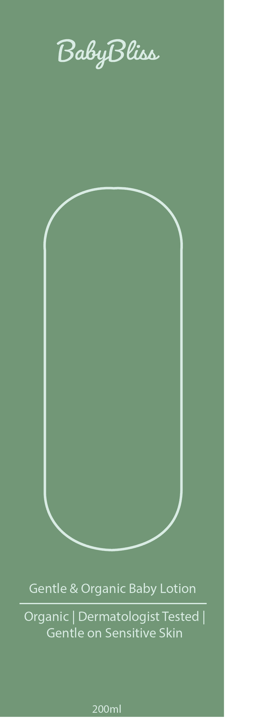
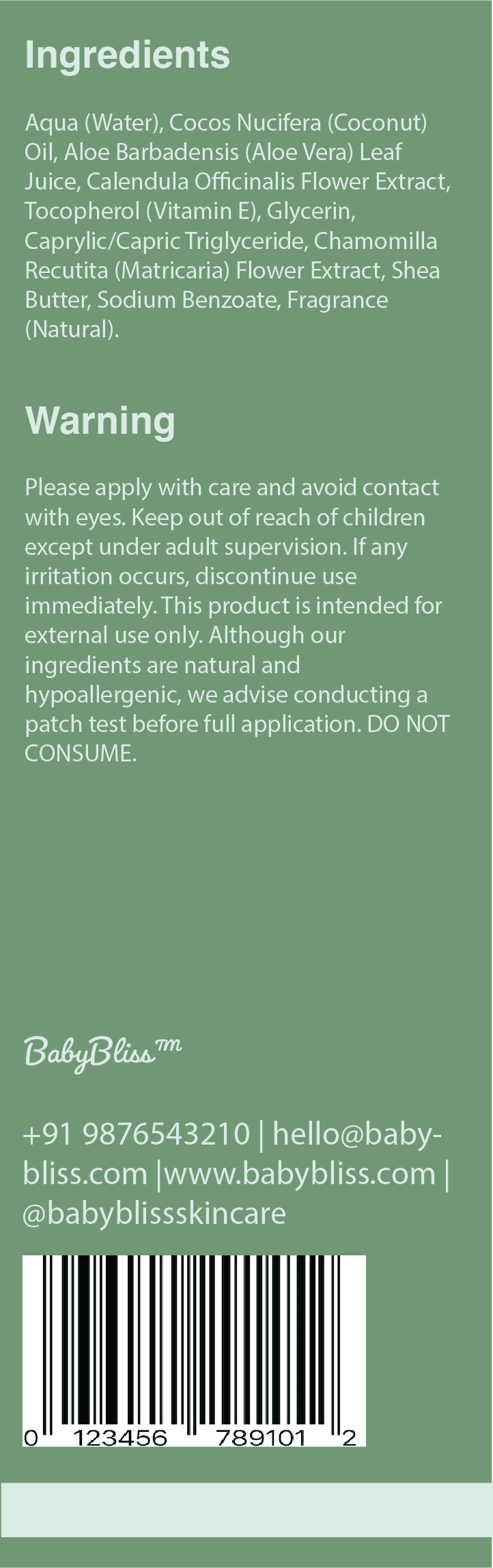
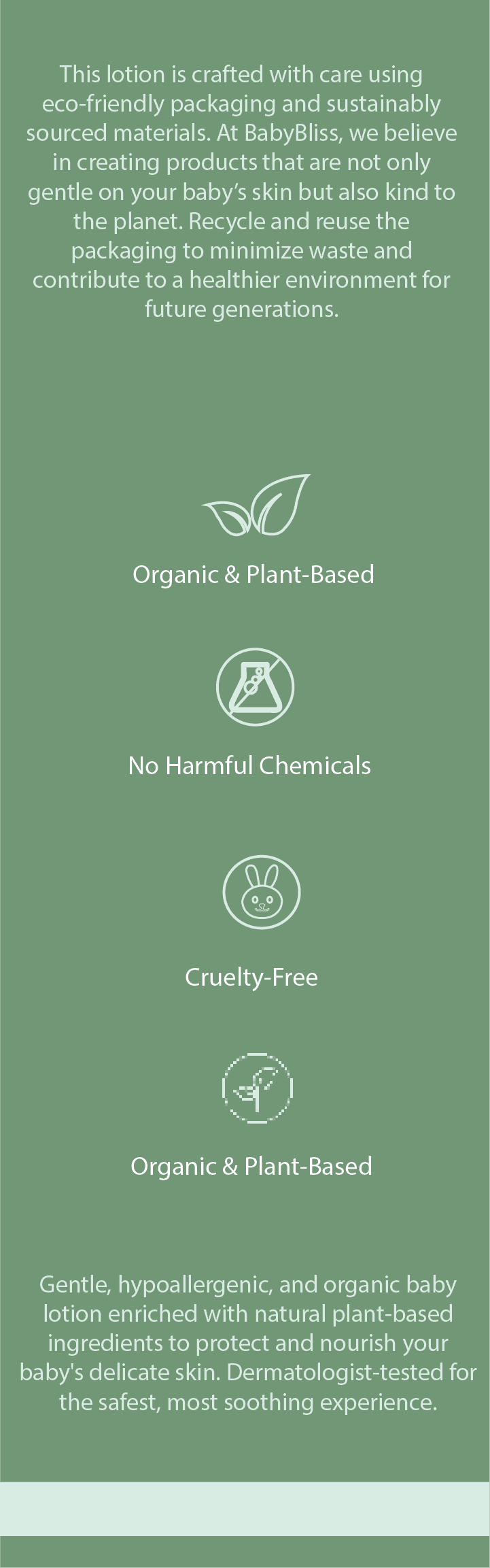
3. Packaging Design
• Designed a 200ml baby lotion bottle and an eco-friendly box with a cut-out window,
allowing customers to see the product inside.
• Used sustainable materials and minimalistic illustrations to enhance the natural appeal.
• Included key product features like hypoallergenic, refillable, and zero-waste.
4. Visual Language & Brand Manual
• Developed a cohesive brand manual detailing logo usage, colors, typography, and
packaging guidelines.
• Ensured a consistent brand presence across digital and print platforms.
PORTFOLIO
CHECK OUT SOME MORE
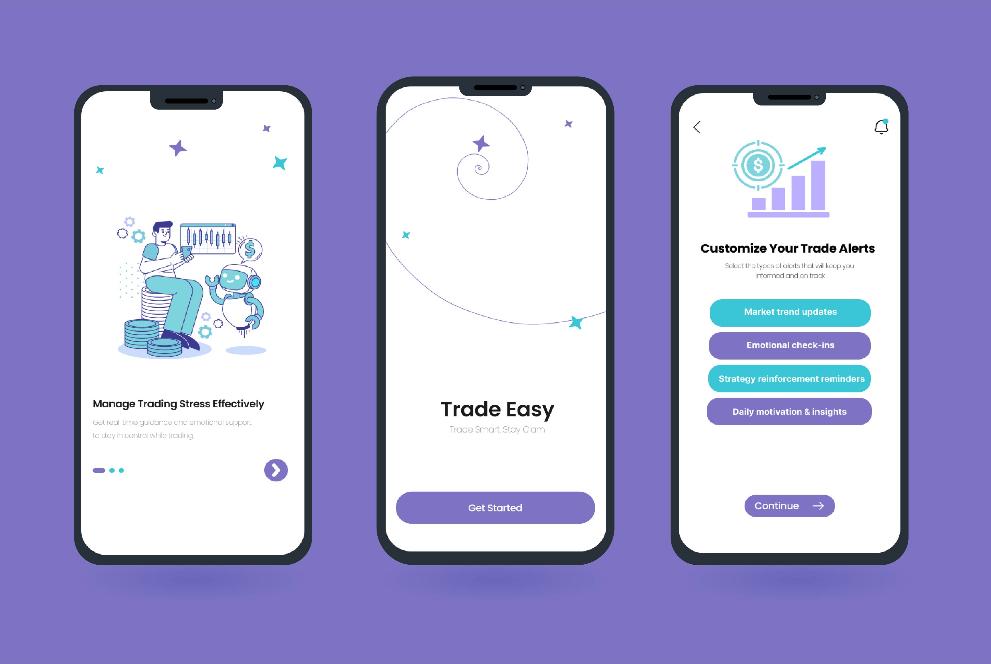
TradeEase
TradeEase
TradeEase

Emotional Support in Trading
User-Centric Interfaces
Digital Design

Budget Tracker
Budget Tracker
Budget Tracker
Personal Finance Management Tool
Financial Tech
Digital Design